Colour Theory in Interior Design: The Psychology Behind Harmonious Spaces
Colour does more than decorate - it directs emotion, energy, and experience. Discover how the psychology of colour shapes every great interior.
Introduction
Colour is one of the most powerful tools in interior design. It’s the first thing people notice when they enter a space, and it quietly shapes how they feel and behave while they’re there. For commercial interiors especially, colour choices go beyond personal preference. They set the tone for the experience, influence customer behavior, and even reinforce brand identity. That’s where colour theory comes in. By understanding the rules and psychology behind colour, designers can create spaces that feel harmonious, intentional, and deeply connected to the brand they represent.
The Basics of Colour Theory
At its core, colour theory is the study of how colours interact and the emotions they evoke when paired together. Designers often turn to the colour wheel as a guide, using it to create palettes that feel balanced rather than chaotic.
- Complementary colours sit opposite each other on the wheel (like blue and orange). Together, they create high contrast and visual energy—perfect for areas where you want attention and excitement.
- Analogous colours sit side by side (like green, teal, and blue). These combinations feel natural and calming, often used to create flow and cohesion throughout a space.
- Monochromatic palettes use variations of a single hue, creating subtle sophistication and harmony without overwhelming the eye.
- Triadic colour schemes use three colours evenly spaced around the wheel (like red, yellow, and blue). This produces vibrant, balanced results when handled with restraint.
- Tetradic (double-complementary) schemes use two complementary pairs. They can be dynamic but tricky, requiring careful balancing of dominant and accent tones.
Beyond pairings, designers consider value, saturation, and hue—the lightness or darkness of a colour, its intensity, and its undertone. For instance, a muted sage green will feel much softer and more approachable than a vivid emerald, even though both fall under the “green” umbrella.
Lighting also plays a role. Natural light shifts throughout the day, while artificial lighting can warm up or cool down colours dramatically. A bright yellow wall that feels cheerful in daylight might look harsh under cool fluorescent lights. Designers account for these changes early on, testing swatches and materials under different lighting conditions before finalizing selections.
.JPG)
The Psychology of Colour
Colour isn’t just visual—it’s highly emotional. People respond to colours instinctively, and interior designers tap into that psychology to shape experiences. Here are some of the most common associations:
- Blue: Trust, reliability, and calm. Frequently used in offices, healthcare, and tech environments to inspire focus and reassurance.
- Green: Growth, balance, and health. Works beautifully in wellness-focused spaces or anywhere you want a refreshing, natural feel—like spas, biophilic workplaces, or eco-conscious retail.
- Red: Bold, energetic, and appetite-stimulating. A go-to for restaurants, entertainment venues, or retail environments that thrive on attention-grabbing energy.
- Yellow: Cheerful and optimistic. Best used sparingly—too much yellow can feel overstimulating, but as an accent it’s uplifting. Great for hospitality spaces where warmth and friendliness are important.
- Purple: Creativity, luxury, and imagination. Ideal for boutique shops, artistic venues, or high-end environments where a sense of sophistication matters.
- Neutrals (white, gray, black, beige): Provide balance and timelessness. They often act as the canvas that allows branded or bold colours to stand out without being overwhelming.
Industry-specific applications show just how strategic colour psychology can be:
- Restaurants often use reds, oranges, or warm neutrals to stimulate appetite and conversation.
- Healthcare spaces lean toward calming blues and greens to reduce stress.
- Retail may use bold accents to draw attention to featured products while keeping the overall palette approachable.
- Educational environments benefit from colours that energize without distracting—greens and blues for focus, yellows for inspiration.
- Corporate offices balance brand colours with neutral palettes to create professionalism while still reflecting identity.
Cultural context matters too. For example, white often symbolizes purity in Western cultures but mourning in some Eastern traditions. Skilled designers are sensitive to these nuances, ensuring colour choices resonate with the intended audience.
.JPG)
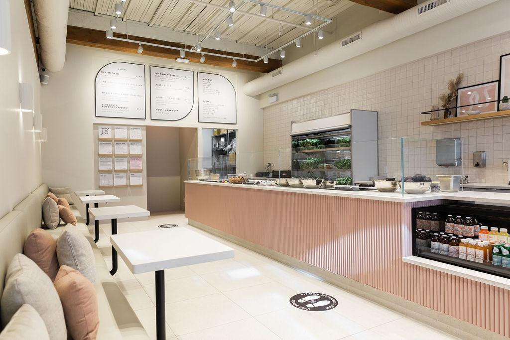
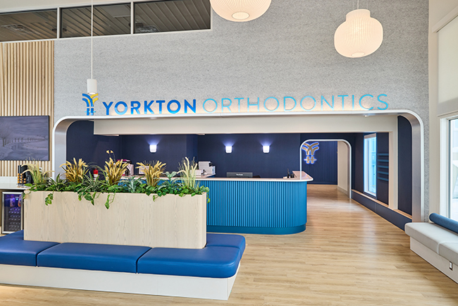
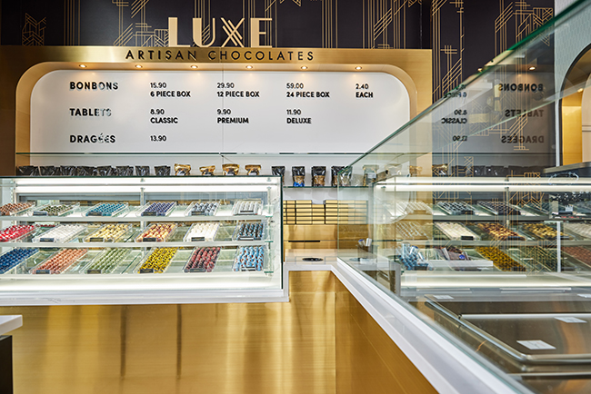
Branding and Colour in Interior Design
For businesses, colour takes on another layer of importance: branding. Customers should be able to step into a space and instantly feel the personality of the brand reflected around them. That’s why interior designers work carefully with brand palettes to ensure consistency without going overboard.
A brand palette typically includes a hierarchy of colours: a primary shade (often tied to the logo), secondary tones that complement it, and neutral anchors. Designers decide how these colours should function in a physical space. For instance, the bold red in a logo might work beautifully in signage or accents but would feel overwhelming across four walls. A muted version, however, could ground a feature wall or appear in upholstery while the brighter version highlights key touchpoints.
Ignoring brand colours risks diluting recognition. Imagine walking into a store that looks nothing like its digital presence. Customers may feel a disconnect, even subconsciously. On the other hand, overusing brand colours can make a space feel cartoonish. The balance lies in weaving the brand palette seamlessly into finishes, furnishings, artwork, lighting, and signage in a way that feels intentional and inviting.
When done well, branded colour integration builds recognition and trust. It tells a cohesive story that extends from the logo to the environment, leaving a lasting impression on every customer who walks through the door.
.jpg)
Finding Harmony in Practice
Creating a harmonious space is all about knowing when to lean into colour and when to hold back. Designers often use strategies such as:
- Layering brand colours with neutrals to prevent overstimulation and ensure longevity.
- Defining zones in a larger space with different palettes, such as using warmer tones in dining areas and cooler tones in lounges, while still maintaining overall cohesion.
- Testing colours under lighting conditions to ensure the palette works at all times of day.
- Pairing colour with texture and materials (for example, combining warm wood finishes with cool blues for balance).
- Avoiding common pitfalls such as oversaturating a space, following fleeting trends too closely, or neglecting how colours transition between connected areas.
Designers also account for durability and maintenance. Some bold colours may fade in direct sunlight or show wear more quickly in high-traffic zones. Choosing finishes and materials that retain their vibrancy ensures the design feels fresh long after opening day.
Why Working with a Designer Matters
Colour theory may sound straightforward, but applying it well takes expertise. It’s easy to misuse colours—creating clashing palettes, overloading a space, or underrepresenting a brand. Interior designers bring the training and experience to interpret both the psychology and branding needs of a space, turning them into a cohesive design strategy.
The process often includes:
- Reviewing a client’s brand palette and goals.
- Developing colour concepts through mood boards, swatches, and renderings.
- Testing colours with samples under different lighting conditions.
- Balancing client preferences with long-term functionality and customer psychology.
Collaboration is key. Collaborating with a designer helps clients see possibilities they may not have considered—like how a muted shade of their brand colour can soften a space, or how an accent wall can tie a room together without feeling overwhelming. This expertise saves time, reduces costly mistakes, and ensures a space feels harmonious for years to come.
.jpeg)
.jpeg)
.jpeg)